A windrose is a graph showing the direction and speed wind is traveling. The windrose shown above depicts the wind behavior in a region of Maine. Wind speed and direction are geographic variables so this can be considered geovisualization or a map.
A star plot is a way of viewing data that contains many variables, all of which link together to form the "star" appearance. The image above shows the amount of elements that together make up a particular basin. As this is a geographic variable, this can be considered geovisualization or a map.
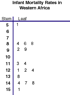
A stem and leaf plot graphs quantities by putting the "stem", or beginning number on the left side of the line then the "leaves" or last numbers on the right side. The graph above shows the infant mortality rates in the West Africa region. Because mortality rates can be considered geographic variables, this constitutes as a geovisualization or map.
A population profile displays the properties of a particular population by dividing them by age and gender. In the image above, a view of indigenous and non-indiginous peoples of Australia are being compared. Population is a geographic variable so this can be considered geovisualization or a map.
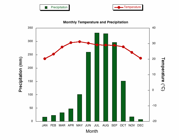
A climograph is a graph depicting climate variables. The image above shows monthly precipitation and temperature in a particular region. Climate is a geographic variable, which makes this a map or geovisualization.
A histogram is a graph that shows the distribution of data. When the variable in question is geographic, the histogram can be considered geovisualiztion or a map. The image above is a histogram constructed from the US census to determine a history of travel time. Since the population is a geographic variable, this is considered geovisualization.
A boxplot is a very precise way to view quantities in a sample set of interest. It shows the range, percentiles, and mean of the set. When the variables are geographic, it can be considered geovisualiztion or a map. The image above shows results from water test from a particular water source. As this is a geographic variable, it can be considered geovisualization.
A scatterplot plots points according to two variables on a chart. When these are geographic variables, it can be considered a map. The image above is a scatterplot of GOP by state versus population in millions. These are two geographic variables, which qualifies this as a map.
An accumulation graph depicts the buildup of a variable over time. When this variable is geographic, it can be considered a map. The image above is an accumulation graph of a species sample over time created by a conservation group researching an area. It allows the species in a specified area to be counted in a census over time, which makes it a map.
A bilateral graph represents two variables of interest and can be considered a map when it deals with gepgraphic data. The map above compares the maximum and minimum temperatures for Australian climate statistics. These are two geographic variables, which classifies this bilateral graph as a map.
A line graph can be a type of geovisualization that depicts geographic data by plotting two variables against one another. The graph above shows the population of Australia's states and territories. Because these are geographic variables, this is considered a geovisualiztion map.
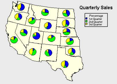
A pie chart map is one in which the variable of interest is displayed using a pie graph over a particular location. The map above shows the western half of the US and the quarterly sales for a company per state. In each pie graph, the percentage of sales is depicted by color.
A univariate map is a choropleth map in which only one variable of interest is being examined over a particular region. The map above shows the results of a happiness survey in each of the US states. Only one variable, the happiness of the population, is being displayed.
A bivariate choropleth map is a choropleth map in which two different variables are displayed on the same map. By graphing them both on one map, viewers can analyze the relationship between the variables more easily than if they were on two separate documents. The map above shows, on the left, the population density, and on the right, the percentage of population change of a district in Russia. It is easier to examine the relationship between these variables of interest because they are on two maps of the same size right next to one another.
An unclassed choropleth map is a thematic map similar to a classed choropleth map (explained in the previous wall post) but with one major difference. Here, the shading is not predetermined to be five colors, but ranges in shade directly proportional to the amount of a variable present in an area. While this gives a more accurate and precise measurements, it is hard to determine by looking at the map alone the exact amount of variable. The map above shows vegetation in northern South America. The shading is directly proportional to the amount of vegetation present.
A classed choropleth map is a type of thematic choropleth map that differences in a variable over a particular area by grouping regions together and representing them with different shades of a color. The map above shows breast cancer rates for white females in the US by state. Each state is assigned a shade, with lighter colors meaning a smaller rate and a higher color meaning a higher rate.
A range graded proportional circle map in which a certain geographic region is displayed with overlying circles. While these circles reflect the amount of variable present in areas, the size of the circle is predefined in the map key and not directly proportional to the variable amount. The map above shows unemployment per state in the US in 2009. The shape of each circle is explained in the key on the right side.
A matrix that compares the similarities between two variables is called the correlation matrix. The image above displays similaries in amino acids. Amino acids could be considered a geographic variable, which allows for this information to be geovisualization or a map.
A planimetric map is a simple map taken from an aerial view that does not usually include any topography or elevation. The map above is of a part of Madrid, Spain. The simplicity of this map makes it ideal for finding your way around an unknown city or giving directions.
A similarity matrix shows the similarities between something graphed on the upper x-axis and something graphed on the lefthand y-axis. The image above represents the effects of a particular drug. Similarities are represented by color. This is a type of geovisualization.
An index value plot shows variations of a phenomenon from base value. The image above is an index value plot of the Equatorial Southern Oscillation Index. The data used to construct the index was taken from climatic measurements, which makes this a map or geovisualization.
A continuously variable proportional circle map is one in which a region is depicted with overlying circles proportional to the size of the variable being examined. The map above shows an area of the UK. The circles represent the results after an election, with each color representing a political and the size of the circle proportional to the number of votes in the area.
A DOQQ, or Digital Orthophoto Quarter Quads, are digital aerial photos that are rectified with a resolution of one meter. They can be color or black and white images. The photo above is an color infrared DOQQ image of Johnston County, North Carolina. It is clear the image was captured using infrared-sensitive lens and has been rectified with a one meter resolution.
Parallel coordinate maps are used to examine many data sets and how they correspond to different factors. The image above gives a 3D view of the mapping of gene expression. Each line from left to right represents one data set that is being compared.
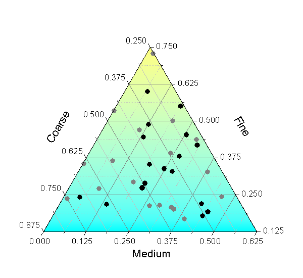
A triangular plot graphs a variable of interest according to three properties depicted on the three sides of the triangle. One very common triangle graph variable, which is shown in the image above, is soil composition and type. The points in the triangle represent sediments of interest mapped according to their thickness. This geographic feature makes this a form of geovisualization.
A DEM map, or digital elevation model, is just that- a 3D representation of the surface of a particular area constructed using elevation measurements. The map above shows the surface of Eritrea, Africa. It was created using satellite-gathered elevation information.
A DLG map, or Digital Line Graph, is a version of a USGS map that shows a vector representation of features. The map above is of a town in Pennsylvania that connects similar features. The red features, for example, all represent transportation.
A DRG map, or Digital Raster Graphic map, is a scanned copy of a USGS topographic map. These scanned maps can be used for digital analysis and for validating digital line graphs. The map above shows an area of Texas with its contours of equal elevation. It is a scanned version of a USGS map, which makes it a DRG.
Isopleth maps are used when the variable of interest is shown from information collected over an area because it cannot be displayed by using a specific point to be connected by lines. The map above shows the 2006 distribution of ammonium ion wet deposition in the US. Areas with the same (according to the key) distribution are shaded the same color.
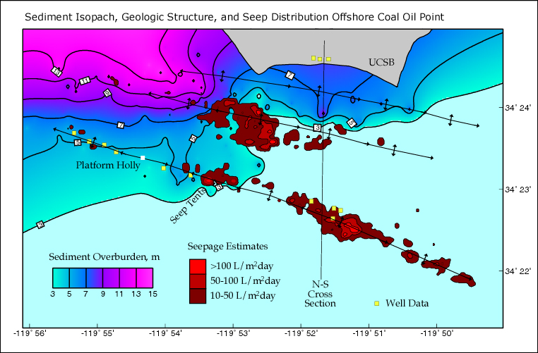
An isopach map depicts areas showing isopachs, or lines that represent equal thickness of a particular geologic feature, usually rocks. The map above shows the geologic structure of a certain area used to extract oil. The lines drawn are isopachs, or similar thickness of the ground sediment, which are important to understand when drilling for oil.
An isohyetal map is a map displaying isohyets, or points of equal precipitation. The map above shows the 1998 precipitation for the state of California. Those areas that are the same color had equal (or almost equal according to the key) amounts of precipitation.
Isotachs are lines on a map that connect points of equal wind speed over a certain region. The map above shows weather over the US. The purple lines are isotachs, which are connecting areas of equal wind speeds.
Isobars are a lines on a map connecting equal points of atmospheric pressure. The map above shows the different pressures above a certain region. The grey lines are isobars which connect points of equal atmospheric pressure at the time the recording was taken.
LIDAR, or LIght Detection And Ranging, sends laser pulses out to measure distance, along with other factors of interest, to objects. Properties are determined by analysis of the returned beams. The photo above shows a bridge in Kentucky, colored according to its thickness and materials. The approximate size of parts of the bridge could be determined from this measurement.
Doppler radar sends signals out from a satellite and then records and analyzes the response time after it bounces of an object of interest. The map above shows cloud coverage over a region. The signals hit the clouds then returned to the satellite, which is how the map could be constructed with accurate cloud locations.
Black and white aerial photography gives a bird's eye view of the earth's surface using only black and white coloring. The map above shows farmland in Missouri. Only black and white coloring is used in the photograph.
Infrared photography is captured using a lens that is sensitive to infrared wavelengths. The photo above was taken using a lens that did not black infrared light. This makes the green mountainside appear red, even though they would not look red in visible light to the naked eye.
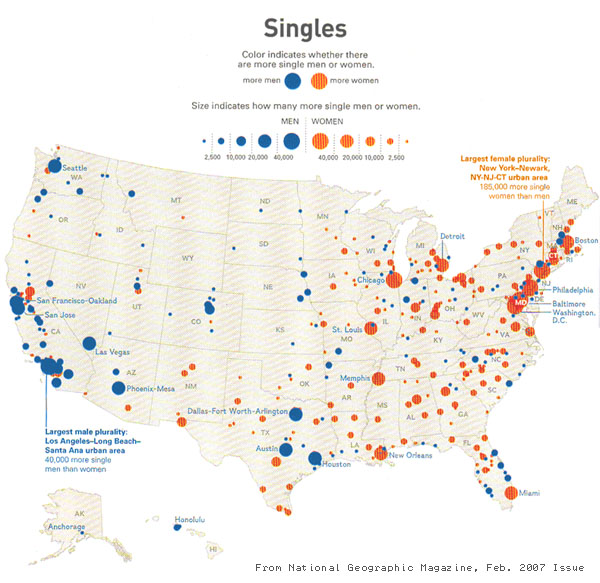
A statistical map shows an area with representation of a certain factor of interest displayed. The map above shows which cities have more men and which have more women. It shows the statistically gathered data for city populations.
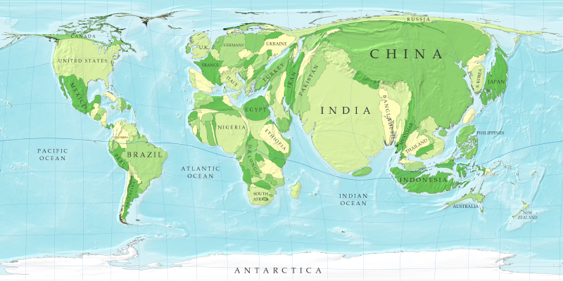
A cartogram is a type of thematic map in which the theme of choice is not displayed with accurate geographical boundaries but mapped according to another variable of interest. The map above is a population cartogram. China is not really that size in comparison with the rest of the geographic world on any scale, but is shown larger than usual because this map was created to be proportional with population size.
Flow maps show the progression of an object or objects from one place to another. The map above shows the Thermohaline Circulation of the Ocean. Also called the Global Conveyor Belt, this pattern shows the circulation that all water in the ocean goes through over a 1000 year period by using arrows to show the pattern.
An isoline map is one that has lines connecting the same value, which could be a variety of things such as temperature, pressure, or elevation. The map above, which, ironically, is of Isoline, TN, shows the elevation of a region. The lines seen are connecting points of equal elevation.
Proportional circle maps show an area overlain by many circles, each of which is proportional to the quantity of the variable present. The map above shows the populations of people in cities who have grown up on both sides ("transnational") of the US-Mexico border. The sizes of these circles is proportional to the population.
A choropleth map is a type of thematic map in which the color shading is directly proportional to the amount that the variable of interest is present in different areas being studied. The map above shows the estimated medium household incomes for each state in the US. For example, California is shaded darker than Missouri, showing that the estimated medium income in California is higher than in Missouri.
A dot distribution map uses dots to represent a variable or phenomenon of interest. They are useful for analyzing the location and density of the phenomenon in an area. The map above shows the cropland harvested in the US. Each dot represents 25,000 acres of harvested land.
Propaganda maps are used to convey a specific message or feeling that agrees with that of the mapmaker. The British map above shows tea exports in 1940. It was created to boost war efforts during WWII.
Hypsometric maps show differences in elevation, but rather than using contour lines alone, they use color shading to depict elevation change. The photo above is a view of the Aegean Sea. The darker blue parts show where the water is deepest and the light blue areas depict shallower water.
The Public Land Survey System was used early in US history to chart and show ownership of land by dividing it into theoretically equal sized (though at the time it was impossible to make measurements so precise) square parcels of land. The map above shows a piece of land divided according to the PLSS. this was used when Americans began settling the West.
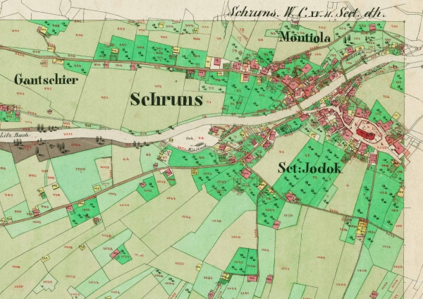
A cadastral map is one which was traditionally used to depict land ownership and use of specific land parcels. It would be used during any type of property ownership dispute to determine land ownership and tenure between neighbors. This map shows a section of Vienna, Austria during the 1800's. It shows individual land parcel uses and ownership, which makes it a cadastral map.
A thematic map is one in which information about a particular geographic region is displayed using a theme. The map above shows which US state governors' offices are controlled by the Democratic and Republican party. The use of shading to depict Republican or Democrat makes this a thematic map.
This is a topographic map of my favorite national park, Yosemite National Park, located in California. A topographic map has a detailed representation of relief to display the geographic features of an area. This map shows the high elevation in the mountainous areas of the park.


